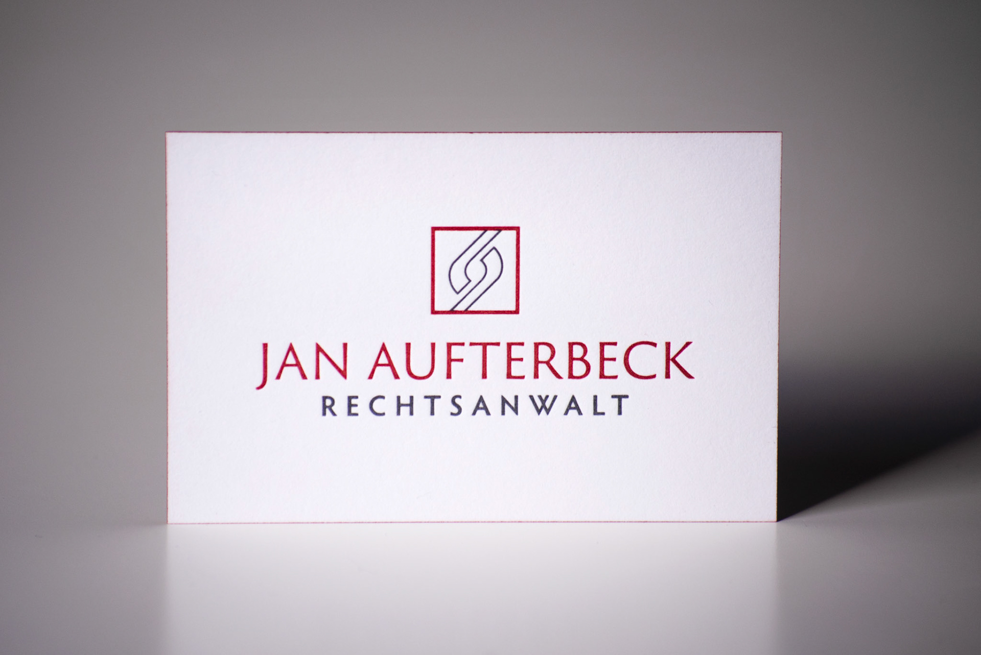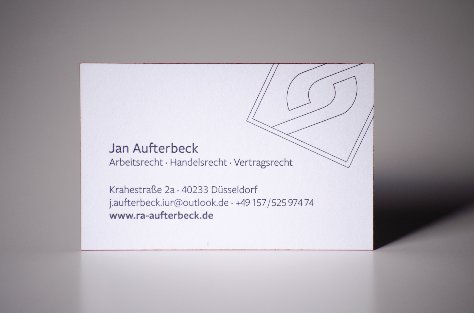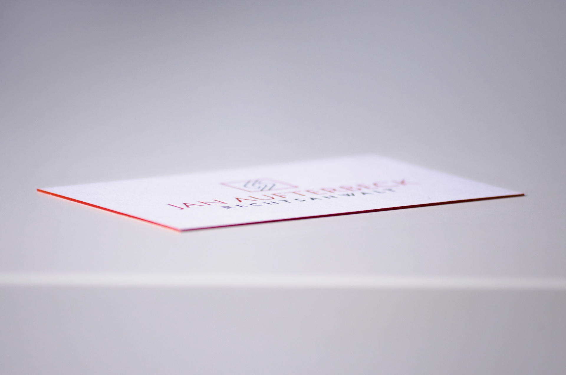


The lawyer Jan Aufterbeck commissioned me to design a new logo for him. The basic idea he brought into the briefing was a square, which should symbolise the negotiating table, and a strong, dark red as the brand colour. The logo had to be usable for the already existing website as well as for documents, but most importantly, it had to look classy on a business card. The strong red and soft grey build a harmonic contrast as well as the square and the shape in between that reminds of a mirrored paragraph character. I decided to combine the classy but modern Trajan Sans Pro with the Hypatia for creating an association with Justitia due to their structural similarities to the Capitalis Monumentalis typeface. The business cards were produced with letterpress in the multi loft technique.
